How to Technically (and Emotionally) Prepare to Exhibit Your Autobiographical Game Jam-Game at an Art Museum
Just want to read the "how-to"? Feel free to skip "The value of exhibiting a non-profitable game", and start reading at the bulleted list of "Exhibiting and logistical challenges I encountered." The former section contains brief discussion of suicide.
On Saturday, December 7, I experienced the delight of exhibiting HOUSTON at the Open World Arcade, hosted at the Akron Art Museum in Akron, Ohio. (The rest of this article will refer to the Open World Arcade as OWA.) This marks the first time I have exhibited a 100% solo-dev'd game of my own making anywhere, not to mention one that was highly autobiographical. I've always felt a little happy-excited-nervous watching people play games I worked on--I didn't anticipate how nervous I'd feel watching strangers react to these interactive, disjointed, deliberately confusing fragments about my own life experiences from just seven months ago.
HOUSTON was--and still is, even after a recent optimization/content update--an "art therapy dump" I poured out of my brain during an itch.io game jam weekend in an attempt to emotionally process the loss of a friendship (and my hubris in that friendship) by narrowing in on a seemingly unrelated event, occurring just days earlier, that restored my faith in humanity, as they say (and I wished the order of events had been reversed, as it would have been way more narratively satisfying). I had picked up the postcard advertising the OWA call for submissions, during GDC, putting it on my fridge as a reminder. A few days after that game jam, I submitted HOUSTON for the event's consideration, and completely forgot about it until mid-September.
The value of exhibiting a non-profitable game
I received the notification email two days after a date that I had chosen, weeks beforehand, as a suicide deadline. After adventuring in the outdoors over the immediately-preceding weekend, I decided to indefinitely postpone that shaky plan, pushing onward into the unknown but living future. Regardless, the email's unexpected arrival seemed to serendipitously validate that I had made the correct choice, if nothing else.
I knew flying across four time zones was not cheap, and I was just about to quit my job with no backup in place--as it is, unfortunately I am still unemployed--but I knew this was One Of Those Things (TM) that was absolutely necessary to do if I wanted to take a chance at making my own art career. I saw this as a challenge to apply what I already know from years of marketing and event management on other people's games and brands, to showcasing my own highly weird experimental artwork.
Furthermore, as a personal rather than intentionally commercial game, HOUSTON was an absolutely perfect fit not just for a museum setting, but for its exhibition theme. If you find yourself in Akron, Ohio before February 2020, I absolutely recommend checking out the museum's seasonal exhibit Open World: Video Games & Contemporary Art, which brought together many thought-provoking pieces that use video games themselves as an art medium. I was delighted to arrive at the museum on OWA day and discover that this accompanying exhibition is definitely not like any "the art of [x]" coffee table-style catalog I've perused before.
Thus, I knew there was a really good chance of a museum visitor being able to appreciate my work, even if they didn't like it. In video games, so many people still use 10-star rating systems in an attempt to describe nuance and preferences, without actually really saying why 7 stars is different from 8. In art, people are allowed to just say that they don't like X artist, or that they think Y is more interesting than Z--but there is always some innately understood need to articulately defend one's own critique of any given artwork, and it's so much more commonplace for museum-goers and art lovers to be equally divided on their opinions. I do not think it is necessary for other people to like HOUSTON. I don't even "like" HOUSTON myself most of the time, because the memories it brings up will always feel bittersweet to me. What I want is for other people to appreciate the fact that I converted this narrative to a format that felt more fitting for its whimsy than a Facebook post could ever do, and that's just way more likely to happen in the inquisitive atmosphere of a museum than on a game expo floor.
Exhibiting and logistical challenges I encountered (and resolved!)
- Making REALLY sure the game is easily understood by real-world players who might not be tech-savvy, definitely much less "art-game-savvy": For the first time ever, I revisited one of my game jam-games to add all the optimizations and edits I wanted to do during initial development time (after verifying with the OWA staff that this was permissible). 80% of the game is still the same as before, but that 20% of polishes made it much more presentable to complete strangers.
- Takeaway: Especially since, in my day-to-day life, most people I know are similar to me in age range and pre-existing tech knowledge, this event was honestly the first best chance I had at observing live reactions and gameplay behaviors from a truly diverse range of players--complete strangers too, not just friends (and no longer just Twitter DMs as the only format of feedback)! Because of the game's tiny scope and simplicity, I had already identified and fixed the most obvious playability and accessibility issues. Nonetheless, I found myself learning even more than I expected from observing my players, via the mirrored laptop display hiding behind the exhibition monitor: how players tended to investigate the images for clickable hotspots (and would not always notice if the pointer icon changed to a hand), how players interacted with the webpages in general, etc. that I would have definitely prepared for in advance if I had known!


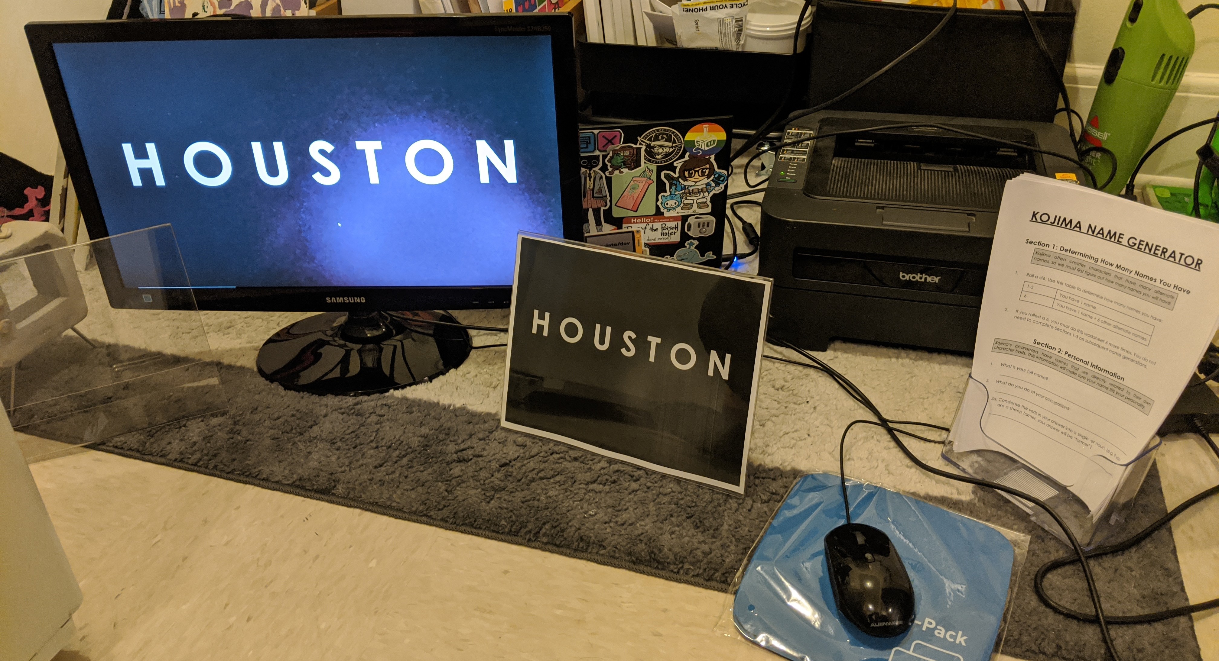
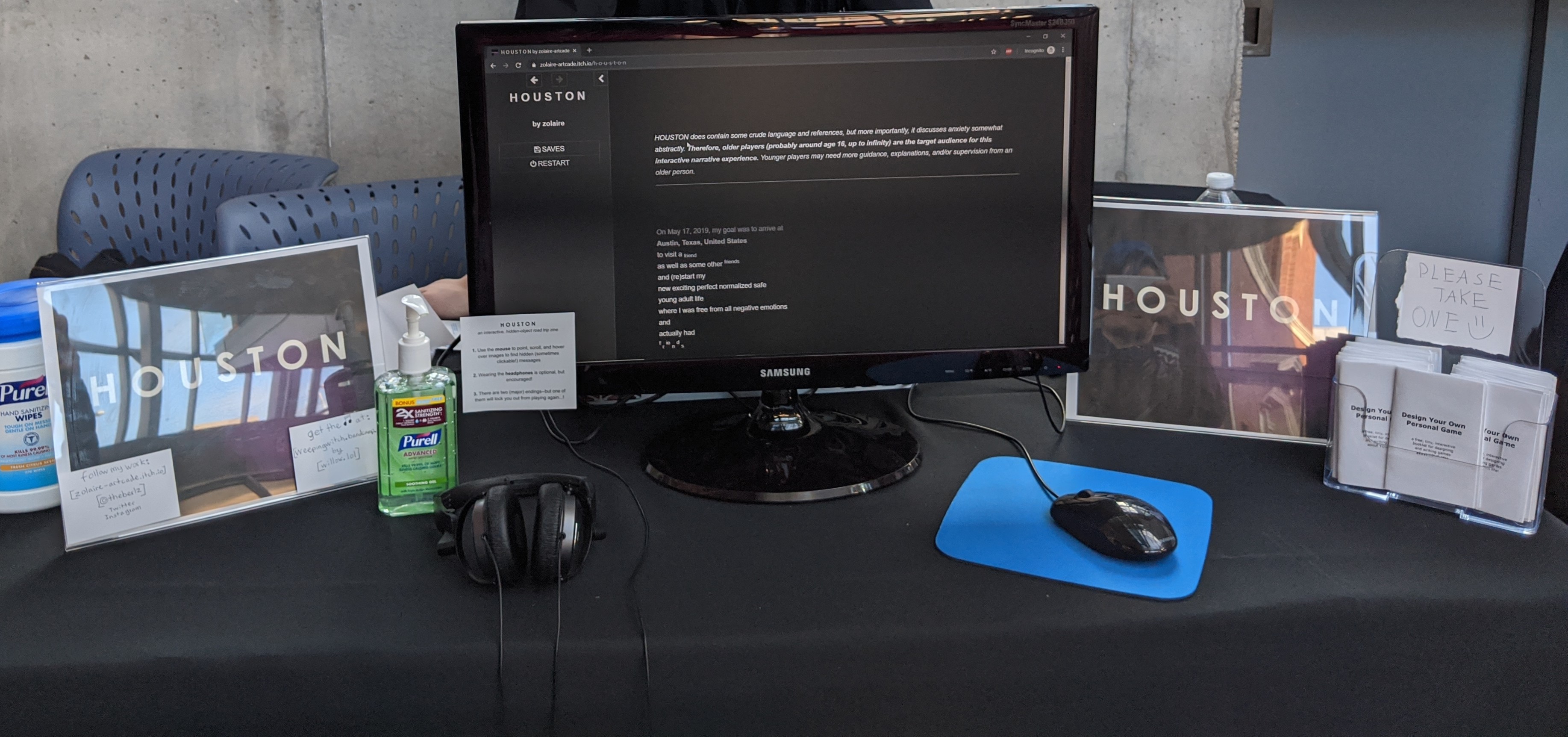
- Exhibition set-up: This part was actually the easiest, ironically because of the restrictions everyone had on their displays (no free-standing exhibit banners; each developer had half of a table's worth of space, resulting in a modest but still pretty cozy display area of 4 feet long by 2 feet wide per game). I actually went to the effort of "prototyping" the display in my apartment, by measuring 4'x2' out on the floor and then arranging my intended elements within that area (also gave me the opportunity to do an equipment check with the exact items I was bringing). Doing this step also prompted me to prepare a USB drive with both the game files and all the table signage files on it, in case a last-minute trip to the print shop (or more) was needed. Finally, going into this event, I had already made plans with Peter Burroughs, a 2D game artist and GDC friend local to Ohio, to help me take turns staffing the exhibit table, so that I could take some breaks throughout the day. To help things go smoothly and take pressure off me to accurately tell him everything, I wrote some "exhibit operation" instructions that he could read in advance.
- Takeaway: The one thing I failed to plan for was checking the dimensions of my largest object (the exhibition monitor) against the luggage I planned to pack it in. I made the last-minute decision to use a larger piece of luggage (requiring a checked bag), and even then, the new bag was just barely perfectly large enough to contain this particular monitor--any bigger, and I wouldn't have been able to bring it at all. However, all my set-up planning translated to reality perfectly, and I had peace of mind having accounted for the most likely contingencies.

- Business cards: I didn't have money to re-order business cards with my correct name on them (thanks, #transprobs), and I also wanted to make sure that Willow (who made the music track I decided to use) had her Bandcamp displayed somewhere, since I had to remove the otherwise interactive "buy-it-here" link from the game credits. Willow told me about reusable business card-signage she had seen other small creators do--make a single card or poster with contact info on it, and secure it on the table such that people will have to take pictures of it, rather than taking an individual copy they will very likely not even look at again.
- Takeaway: Given that this was a small, gallery-esque event at a small, suburban art museum attended by mostly families, I didn't see anyone taking pictures of the social media info signs. Regardless, I absolutely loved the fact that I wasn't generating extra paper waste. It was a highly practical setup for my needs, and I would even do it again at an event where people did collect business cards.

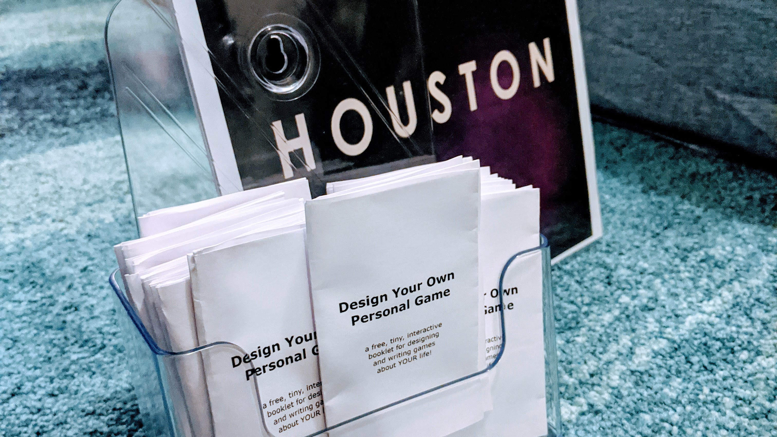
- SWEET MERCH AND SWAG: Given my experience in producing and handling merchandise in my marketing jobs, within ten minutes of getting that acceptance email from OWA I was already deep in thought on if I should make stickers or collectible postcards of the visuals in HOUSTON as free table swag. Two weeks before OWA, I was still stuck on this--until I decided to check in with the museum staff about their visitor demographics. I remembered exhibiting a game, years ago, aimed primarily at high school teens and educators at the Salt Lake City Maker Faire, and how a lot of much younger kids had shown up instead--causing us to modify our booth's game design activity on the fly to accommodate the interest of younger brains. Especially after I had re-evaluated HOUSTON and realized that some of the writing was not exactly child-friendly, I realized the best "swag" I could distribute was a one-page zine about designing your own personal game.
- Takeaway: The free zines were a big hit at OWA. As I predicted, their existence gave me an opportunity to have fleeting but positive interactions with more museum attendees than I otherwise would have, since I knew HOUSTON was deliberately niche enough that it would not draw most kids' attention (or even most adults' attention). I had made the zines to be something I could offer guilt-free to a bored-looking toddler who might want to just play and color on it. I was happily surprised and relieved that they also held some appeal for the adults in the venue, including the OWA staff and some of my fellow devs (especially those who were also interested in games education). I got to talk about the value of Twine as a wonderfully accessible game development tool to interested parents AND their interested kids! Even for much older students who are already learning Unity or other complex development tools, the zine can introduce them to the value of personal/autobiographical games, no matter how they're made, as a tool for self-expression and creating something for its own sake.
- Paying for everything: I estimated I needed a minimum of $500 to afford the trip basics (flight, 1 night in a hotel room [with an additional hotel night being covered by OWA sponsor funding] and misc. costs like exhibit signage and unfortunately necessary-airport snacks). I was being conservative with my estimate so as to make it more likely that I would reach my goal. I made a GoFundMe. One small donation came from an internet stranger, but the entire rest of it came from friends I already knew IRL and, in most cases, had mentioned the GFM to them in a one-on-one conversation, even if I didn't directly ask them to donate.
- Takeaway: My total received amount of $520 ended up being just over $500 after fees. This was definitely not a big deal to resolve in my case, but it's something I would account for in the future by not trying to shortchange my needs as much as possible. In total I ended up spending ~$600 on this trip (a T-shirt from the museum gift shop, additional food purchases, taking a Lyft or two, extra hotel room taxes).
- Takeaway: Knowing how to ask for help is something that takes most of us years, if not our whole lives, to learn. I've never made much money at any of my jobs, but knowing me, I probably would have tried to pay for this entire trip by myself if I was so much as making exactly $500 a month. By the time I made the GFM, I had humbly accepted that this event was important for me to do because of the mental health side-effects of struggling to find work, not despite the fact that I'm poor. I also had to realize that even though my friends and I feel #relatable to one other and treat each other as equals--when it comes to money, most of my friends and contacts aren't unemployed, and some people are even actually paid well (sometimes very well!) at their jobs, and are happy to share the benefits of that with other friends, if they know that a specific need exists. Don't apologize for asking for help.
Final takeaways
This article now joins the congregation of blog posts, Twitter threads, and Reddit discussions anyone can find online about showcasing games at events--the context of your game's purpose and theme, your own business/developer goals, and the nature of the event itself can all drastically change what makes an effective game booth. Theoretically, any type of game can thrive in a museum setting when game devs and museum staff honor and learn from each other's respective expertise. My exhibit was definitely dramatically improved when I asked the museum staff for their insights on expected attendees, and put some thoughtful effort into making sure anyone who passed by my table could have a positive experience, whether or not they played the game.
One interesting design factor I did not mention was the role of the Akron Art Museum staff in arranging the Open World Arcade games/tables as they did--this was a factor entirely outside of my control, and I had no knowledge of it before arriving. The developers were split across two sets of tables facing each other in the main lobby--most of the developers were placed on tables arranged in a very wide letter-U shape, while a few others were placed on a straight line of tables facing the U. The museum seemed to have a good sense of the genres represented, and arranged the games in such a way that attendees would encounter uniquely different games next to each other. I appreciated that, whether by choice or by chance, HOUSTON was placed in the middle of the U-shape, rather than at one of the U-ends. If the latter situation had occurred, I honestly think it would have made it easier for people to breezily skip past my game, especially as the first thing people see on the monitor is a minimalist text display--not quite as instantly visually understood as most of the other games.
In the late afternoon, I watched a parent and child play the game--they were one of the few players who got all the way to the end, and only one of two players who got the "secret ending." (To be honest, I did not know that my game had a secret ending until I started seeing how most people tended to click around the images.) I blushed and apologized whenever the child found one of the hidden messages that had an F-bomb in it, even though neither of them cringed at all and had definitely read the content/age warning displayed at the very beginning. The parent asked me to clarify the narrative context.
"So, it's like a therapeutic experience," she said, smiling kindly at me.
I was immediately filled with intense relief, and yet even more vulnerability than before. She saw me.
Get H O U S T O N
H O U S T O N
A hidden-object/hidden-thoughts road trip zine
| Status | Released |
| Author | zolaire-artcade |
| Genre | Interactive Fiction |
| Tags | Hidden Object, zine |
More posts
- Small content/quality update & pricing changeDec 10, 2019
- I want to exhibit HOUSTON at the Open World Arcade!Nov 04, 2019
Leave a comment
Log in with itch.io to leave a comment.